
This morning, while I was busy watching Game 1 of the Heat-Pacers series (coach Vogel, why did you take Hibbert out in the last couple of plays?) while doing laundry, a wild news article appeared:
Ateneo prof's 60-30-10 poll results pattern gets Comelec's attention
The article talks about Ateneo de Manila Associate Professor Lex Muga and his observation of an "interesting" pattern in the polling of partial results in the last Senatorial elections. And if one takes a look at his recent public Facebook posts on the matter, one will see the following graphics.


While Dr. Muga does not explicitly say anything in his Facebook posts, the article above managed to elicit his more exact thoughts on the matter:
“May pattern. Interesting pattern. Sabi ko nga na parang 60-30-10. Ang tanong ko, bakit ‘pag kunin mo ‘yung mga actual votes sa first canvass, second canvass, kuha sila mula sa isang probinsiya lang bakit 60-30-10 pa rin? Hanggang 16. ‘Di ba manggagaling naman sa iba-ibang probinsiya ang COCs (certificates of canvass) eh? So baka ‘di dapat ganun. Dapat merong variation," Muga said in an interview aired on GMA News' "24 Oras." (Emphasis is mine. - IJ)
In English, "there should be variation in the data," which implies that Dr. Muga sees no variation and that the "60-30-10" pattern is the same across all 16 canvas results.
This is where things turn for the wrong.
One thing that you'll notice in Dr. Muga's statistics and graphics is that there is no mention of sample size, or how large the data set involved is--and inadvertent or not, this is a critical omission. Yes, to the naked eye, the numbers seem to form a pattern. Yes, when our minds look at the data, there don't seem do be any significant differences in the proportion of votes for each coalition from canvas to canvas. However, the problem is that our eyes and minds are not always capable of seeing or comprehending differences that matter. Any student of elementary statistics should know that even seemingly small or immaterial differences matter if the sample is big enough.
All the tools that we need are available to see if there is indeed a statistically significant pattern of constancy in the data. The data that Dr. Muga used is here. And you can follow the results of my analysis with this Excel file.
Some clarifications before we start:
- What are we trying to prove or disprove? That the pattern that Dr. Muga has observed exists, that the proportion of votes that went to each political coalition is constant from canvas to canvas.
- For the sake of expediency, we will just focus on the proportion of votes for Team PNoy candidates.
- We will use the incremental increases in votes from canvas to canvas. Seriously, it's idiotic to use the cumulative totals: of course it's going to converge to the population average, the denominator keeps on getting bigger and approaching the total number of senator-votes.
- Since each voter can vote for 12 senators, then the appropriate unit of analysis is the senator-vote, where each voter has a maximum of 12 senator-votes. The number of "votes" in the spreadsheet or results are therefore not the same as the number of voters, but rather the number of senator-votes.
Test 1: Comparing confidence intervals
A confidence interval is an interval estimate for a number that we don't know the true value of. For example, if the 95% confidence interval for the proportion of votes that went to Team PNoy is 59% to 61% (or [59%,61%]), then we can say that there is a 95% chance that the true proportion is between 59% and 61%. Why do I use the qualifier "true"? The true proportion is not exactly known because we don't have the complete results yet; each canvas tabulation is just a representative sample of the total population of senator-votes.
In the "PNoy" tab, I have computed for the confidence interval for each sample (i.e., canvas result) using the formula below at the significance levels 0.05 and 0.01 (significance levels basically measure how much room for error you are willing to accept).
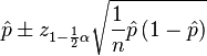
Confidence intervals make comparing two estimates easier. Basically, if the confidence intervals for two estimates overlap, then they are statistically equal. BUT if the confidence intervals don't overlap, then there is enough statistical evidence that the estimates are not equal.
In the "PNoy Confidence Intervals" and "PNoy Confidence Intervals (2)" tabs, I have compared the confidence intervals of the proportion estimates for each canvas using significance levels of 0.05 and 0.01, respectively. Both results show that out of 120 confidence interval pairs, only 3 overlap (3 vs. 14, 9 vs. 10, and 6 vs. 8). This means that up to a 1% significance level, 117 out of 120 pairs are statistically different! This method therefore rejects the hypothesis that there is no variation in the data, or that the proportion of votes for Team PNoy is the same from canvas to canvas. Almost all of the proportions are statistically different!
Test 2: Chi-square goodness of fit test
We can use this test for the hypothesis "the proportion of votes that went to each political coalition is constant from canvas to canvas" in one step. The proportion of the total number of votes up to the 16th canvas is 59.63%. If we assume that the same proportion of incremental votes in each canvas voted for Team PNoy, then the coalition should get the expected number of votes E per canvas, as shown in the "Chi Square" tab.
The Chi square statistic is given by

If the statistic is big enough, it means that the set of observed or actual votes (O) for Team PNoy is statistically different from the set of expected votes (E), and the hypothesis is rejected.
The resulting Chi square statistic is 50,000+, which is more than enough to reject the hypothesis. Again, the data shows that the proportion of votes for Team PNoy is statistically different from canvas to canvas.
Test 3: The "Random Coalition" eyeball test
There are plenty of things in statistics (or in the entire universe, actually) that are counter-intuitive or are hard to understand.
Take this last "test," for example. Choose any 9 senatorial candidate at random from the list of 33. I used my calculator's "Ran#" to draft my "dream team" of random senatoriables:
 |
| Please click to enlarge. |
Plotting the percentages using the same axis as Dr. Muga, we get:

What wizardry is this? A similar pattern for a random group of candidates?
We also have to remember, however, that a lot of times, things are not as simple or straightforward as they look. The same data using a different vertical axis:

Replication of graph for Team PNoy proportion of votes that Dr. Muga posted in Facebook:

Same data, using a different vertical axis.

*Sigh*
I'm sure a lot of shenanigans happened in the last elections. There's one more thing that I'm sure of, though: whatever happened is not reflected by the data, and that the "interesting" pattern that Dr. Muga observed does not really exist.
Just remember two things: 1) the sample size matters; and 2) framing matters.
For those who missed it, the Excel file that contains all the data and analysis is here.